This multifaceted project unfolds through three key software tools: RStudio, SAS Studio, and Tableau Public. With "gapminder.csv" and "Covid19DataCDC.xlsx" datasets as their canvas, students edit Flex Dashboards, craft SAS code for needle plots, and explore Tableau's map-making capabilities. This rich experience sharpens their data visualization skills while offering a nuanced analysis of COVID-19 data trends. Through diverse visualizations, students deepen their proficiency in data interpretation and presentation.
Problem Description:
The Final Data Visualization assignment, is a multifaceted assignment involving RStudio, SAS Studio, and Tableau Public. Students are tasked with creating data visualizations based on "gapminder.csv" and "Covid19DataCDC.xlsx" datasets. This comprehensive project encompasses tasks ranging from editing Flex Dashboards to SAS coding for needle plots and Tableau-based map creation. It fosters proficiency in diverse software tools while analyzing COVID-19 data trends, ultimately enhancing data visualization skills.
Part 1: Data Visualization in RStudio
- Description: This section centers on harnessing the capabilities of RStudio for diverse data visualization tasks.
- Instructions: You will commence by downloading essential files, fine-tuning a Flex Dashboard template, and running R code chunks to generate visualizations.
- Question 1:Loading Data – On the Dashboard, the initial step is to capture a screenshot of the "Loading data" page and furnish a comprehensive summary.
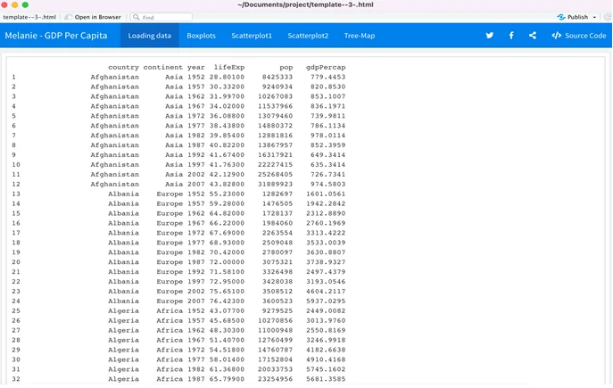
Fig 1: Window showing that the data was uploaded successfully
Summary: The "Loading data" page serves as evidence that the dataset was successfully loaded. It exhibits an array of variables including country, continent, year, and life expectancy, confirming a successful data import from the CSV file. This tab essentially displays the contents of the CSV file.
- Question 2:Boxplots – The subsequent stage is to capture a screenshot of the "Boxplots" page and elucidate the insights derived from this visualization.
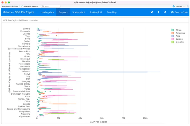
Fig 2: boxplot demonstrating the locality, spread and skewness groups of GDP Per Capita among different countries
Summary:The boxplot visualization illustrates the distribution of GDP Per Capita across various countries, focusing on quartiles. It features the first quartile, median, and third quartile, offering an intuitive portrayal of GDP Per Capita for different countries. Lebanon stands out with the highest GDP per Capita.
- Question 3:Scatterplot1 – Capture a screenshot of the "Scatterplot1" page and provide an in-depth summary of the insights conveyed by this visualization.
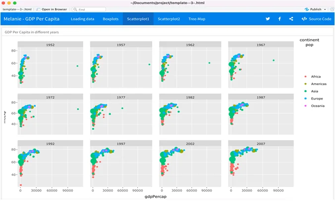
Fig 3: window showing the GDP per capita of continents such as Africa, America, Asia, Europe, Oceania in different years
Summary: The "Scatterplot1" visualizes GDP per capita across continents (Africa, America, Asia, Europe, Oceania) for various years. Each continent is represented by a distinct color. In 2007, Europe and the Americas exhibit the highest GDP per capita.
- Question 4:Scatterplot2 – Capture a screenshot of the "Scatterplot2" page and furnish an extensive summary. Additionally, elucidate the differences between Scatterplot1 and Scatterplot2.
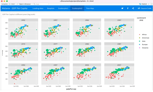
Fig 4: Window showing the GDP per capita of continents such as Africa, America, Asia, Europe, Oceania in different years
Summary:"Scatterplot2" mirrors the GDP per capita across continents for different years. Similar to Scatterplot1, it employs color-coding for continents, but the significant difference lies in the use of a log scale in Scatterplot2.
- Question 5:Tree-Map – Capture a screenshot of the "Tree-Map" page and furnish a comprehensive summary. Identify the countries with the highest and lowest average life expectancy.
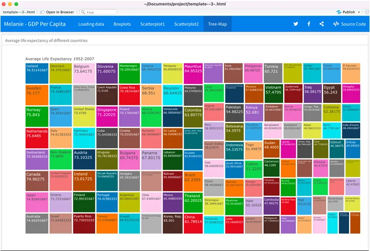
Fig 5: Tree Map showing the countries with life expectancy
Summary:The "Tree-Map" visualizes average life expectancy across countries. Iceland boasts the highest life expectancy, while Sierra Leone reports the lowest life expectancy.
- Overall Experience: Express your level of satisfaction with each software package. Identify the easiest and most challenging software, along with sharing your overall experience with the project.
Working with these three software packages offered a multifaceted experience. RStudio stands out for its flexible visualization options, particularly through the Flex Dashboard feature. Tableau Public, on the other hand, excelled in simplicity and ease of use due to its drag-and-drop interface. SAS Studio proved to be the most challenging due to its complex syntax and error-prone nature.
The Final Data Visualization Project has been a rewarding journey, providing valuable insights into data visualization techniques using distinct software tools. The acquired skills have equipped me to create diverse visualizations for future projects.
Part 2: Data Visualization in SAS Studio
- Description:In this section, you'll leverage SAS Studio to create graphics based on the "Covid19DataCDC.xlsx" dataset.
- Instructions:You will run specific SAS code to produce visualizations that will help analyze the COVID-19 data.
- Question 7:New COVID-19 Cases in Illinois – Execute the provided SAS code to generate a needle plot for new COVID-19 cases in Illinois. Capture and paste the plot and summarize the trend of new cases in Illinois.
PROC SGPLOT DATA = WORK.IMPORT ();TITLE 'Trend of New COVID-19 Cases in Illinois'; NEEDLE x = submission_date y = new_case / MARKERS MARKERATTRS = (SYMBOL = circlefilled SIZE = 5px); YAXIS GRID LABEL = 'New COVID-19 Cases'; XAXIS GRID LABEL = 'Submission Date'; RUN;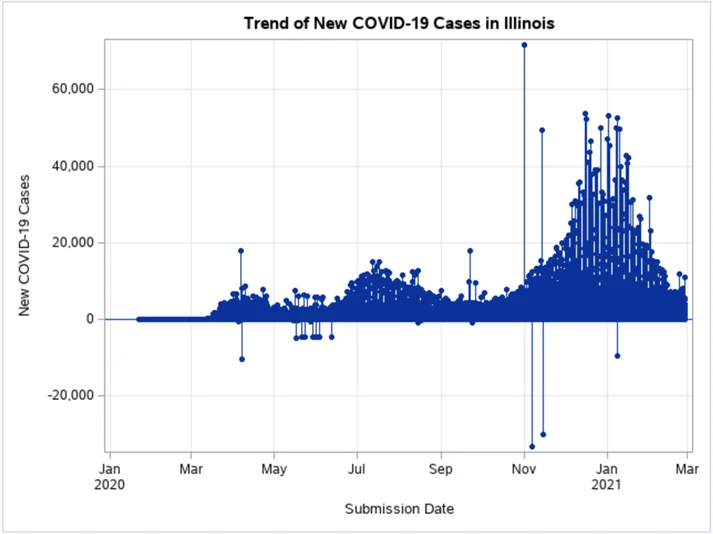
Fig 6: Plot showing the new COVID-19 cases in Illinois
Summary:The needle plot indicates the trend of new COVID-19 cases in Illinois over 403 days. Notably, the data depicts a surge in cases around March, followed by fluctuations and significant spikes in November. Understanding these trends aids in evaluating the COVID-19 situation in Illinois.
- Question 8:Comparative Needle Plot for Illinois and Michigan – Use the supplied code to create a needle plot comparing new COVID-19 cases between Illinois and Michigan. Capture and paste the plot and provide a comparative analysis of the trends.
PROC SGPLOT DATA = WORK.IMPORT (); TITLE 'Trend of New COVID-19 Cases between Illinois and Michigan'; NEEDLE x = submission_date y = new_case / GROUP = state MARKERS MARKERATTRS = (SYMBOL = circlefilled SIZE = 5px); YAXIS GRID LABEL = 'New COVID-19 Cases'; XAXIS GRID LABEL = 'Submission Date'; RUN;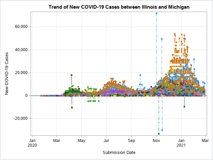
Fig 7: Plot showing the new COVID-19 cases between Illinois and Michigan
Summary: The comparative needle plot highlights the disparity in new COVID-19 cases between Illinois and Michigan. The data showcases fluctuations in both states, with periodic spikes. This visual comparison aids in assessing the impact of the pandemic in different regions.
- Question 9:Comparative Needle Plot for Florida and Texas (including cases with negative values) – Apply the provided code to generate a comparative needle plot for new COVID-19 deaths between Florida and Texas. Capture and paste the plot and compare the trends. Explain the meaning of negative values in the context of new COVID-19 deaths.
PROC SGPLOT DATA = WORK.IMPORT (); TITLE 'Trend of New COVID-19 Deaths between Florida and Texas'; NEEDLE x = submission_date y = new_death / GROUP = state MARKERS MARKERATTRS = (SYMBOL = circlefilled SIZE = 5px); YAXIS GRID LABEL = 'New COVID-19 Deaths'; XAXIS GRID LABEL = 'Submission Date'; RUN;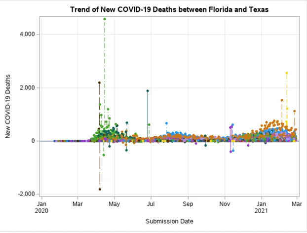
Fig 8: plot showing the new COVID-19 death between Florida and Texas
Summary: The comparative needle plot depicts the trends in new COVID-19 deaths between Florida and Texas. It reveals fluctuations, occasional spikes, and differences in the fatality rates. Negative values could imply data corrections, where previously reported deaths were adjusted or revised.
Part 3: Data Visualization in Tableau Public
- Description: In this segment, you'll utilize Tableau Public to create visualizations based on the "Covid19DataCDC.xlsx" dataset.
- Instructions: You will connect the data file and produce maps and treemaps for in-depth COVID-19 analysis.
- Question 10: COVID-19 Cases Map – Create a map using Tableau Public by connecting "Covid19DataCDC.xlsx." Capture and paste a screenshot of the map along with a summary of the information it conveys.
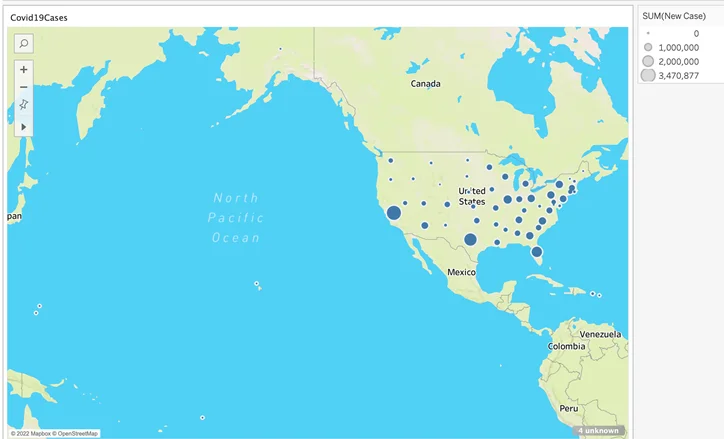
Fig 9: map showing the new covid cases of different states.
Summary: The map visualizes COVID-19 cases in different states, such as California, Texas, Illinois, Colorado, Hawaii, Oregon, and Idaho. It provides a clear overview of the number of cases reported in each state.
- Question 11:COVID-19 Deaths Map – Generate another map in a new worksheet to visualize COVID-19 deaths. Capture and paste a screenshot of the map and provide a summary of the information it displays.
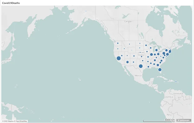
Fig 10: map showing the new death cases of different states
Summary:This map showcases COVID-19 deaths in various states, including California, Arizona, Texas, Oregon, Washington, and Illinois. It offers insights into the fatality rates in different regions.
- Question 12: COVID-19 Deaths Treemap – Develop a treemap in a new worksheet using the same data, depicting COVID-19 deaths. Capture and paste a screenshot of the treemap and summarize the insights it provides.
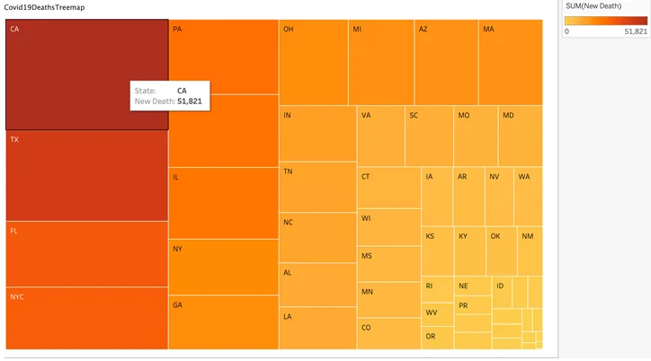
Fig 11: Treemap shows the new death cases of different states
Summary:The treemap vividly illustrates COVID-19 deaths in states, featuring California, Arizona, Texas, Oregon, Washington, and Illinois. The treemap format enhances the organization and accessibility of this data, facilitating easy comparisons.
Overall Experience
- Description: Reflect on your overall experience working with the three software packages and share your satisfaction levels and the reasons behind them.
The Final Data Visualization Project has been an enriching journey. Each software package brought its unique strengths and challenges:
- RStudio: RStudio provided versatility with its Flex Dashboard, offering an array of visualization options. The ease of creating various plots was a notable advantage.
- Tableau Public: Tableau Public emerged as the most user-friendly tool. Its drag-and-drop interface simplifies visualization creation without the need for extensive coding.
- SAS Studio: SAS Studio was the most complex, with intricate syntax. Debugging errors was challenging, but it deepened my understanding of data manipulation in SAS.
This project has been a valuable learning experience, equipping me with the skills to create diverse visualizations. It's a journey that has broadened my proficiency in data visualization, setting a solid foundation for future endeavors.
Related Samples
Explore our extensive sample section for a deeper dive into statistics-related topics. From regression analysis to hypothesis testing, our samples provide practical insights and examples to enhance your understanding. Delve into real-world scenarios and see how statistical concepts are applied in various contexts. With a wide range of samples available, you'll find valuable resources to supplement your learning and excel in statistics.
SAS
R Programming
SAS
tableau
R Programming
R Programming
SAS
R Programming
R Programming
R Programming
SAS
R Programming
R Programming
R Programming
R Programming
R Programming
SAS
R Programming
R Programming
R Programming
