Data Analysis and Probability Scenarios in Organizational Decision-Making
-1.webp)
- Problem Description
- Conclusion
Problem Description
This data analysis assignment using probability delves into a comprehensive analysis of employee data, encompassing job level, education, and sector distribution. It provides a detailed exploration of salary statistics, highlighting non-normality and the need for further investigation. Additionally, it delves into probability scenarios for TV life, service time, and orange delivery. The analysis extends to process capability, production process stability, and a time series forecast, underscoring the significance of data-driven insights for organizational success.
Question 1: Employee Data Analysis
The objective of this analysis is to gain insights from employee data, focusing on various variables including Job Level, Sector, Education, and Salary.
1.1 Job Level Distribution
| Job Level | Count |
|---|---|
| Junior | 83 |
| Manager | 295 |
| Senior | 304 |
| Total | 682 |
Job Level Distribution Table
This chart represents the distribution of employees across different job levels. It indicates that out of the 682 employees, 83 are in the junior role, 295 in managerial positions, and 304 hold senior positions.
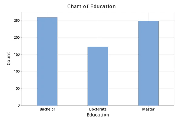
Fig 1: Chart of education of employees
1.2 Education Level
Education is categorized as follows:
- Bachelor’s: 38%
- Master’s: 37%
- Doctorate: 25%
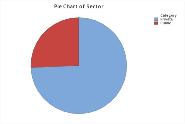
Fig 2: Pie chart showing the percentage of employees in both private and public sector
This pie chart illustrates the proportion of employees with various education levels, highlighting that 38% have a Bachelor’s degree, 37% hold a Master’s degree, and 25% have a Doctorate.
1.3 Sector Distribution
| Sector | Percentage |
|---|---|
| Private | 74% |
| Public | 26% |
Sector Distribution Table
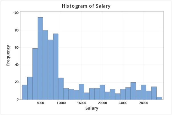
Fig 3: Histogram of salary frequency
The chart displays the distribution of employees in private and public sectors. It shows that 74% of employees work in the private sector, while 26% are employed in the public sector.
1.4 Salary Statistics
| Variable | N | N* | Mean | SE Mean | StDev | Minimum | Q1 | Median | Q3 | Maximum | Skewness | Kurtosis |
|---|---|---|---|---|---|---|---|---|---|---|---|---|
| Salary | 682 | 0 | 13,310 | 270 | 7,039 | 4,830 | 8,171 | 10,471 | 17,581 | 30,534 | 1.07 | -0.17 |
Salary Statistics Table
The table presents descriptive statistics for the 'Salary' variable. It includes key metrics such as mean, standard error of the mean, standard deviation, minimum, 1st quartile, median, 3rd quartile, and maximum. Additionally, it provides measures of skewness and kurtosis to understand the distribution.
1.5 Salary Distribution Analysis
Histogram of Salary
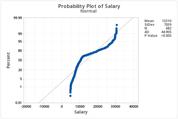
Fig 4:Probability Plot of Salaries
The histogram of salaries suggests non-normality. The distribution is right-skewed, indicating that salaries are concentrated on the lower end.
Normality Test
To validate the observation from the histogram, a test of normality was conducted. The result, presented in the probability plot, indicates that the variable 'Salary' is not normally distributed since the p-value (0.05) is less than the significance level.
1.6 Age Analysis
Box Plot of Age
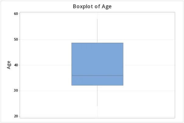
Fig 5:Boxplot of age
The box plot of 'Age' indicates there is no evidence of outliers, suggesting that no employees fall outside the typical age range, ensuring a balanced age distribution.
1.7 Pareto Chart
A Pareto chart helps distinguish the "vital few" from the "trivial many." In this context, it demonstrates that both Engineering and IT collectively account for more than half (52.1%) of the total salary.
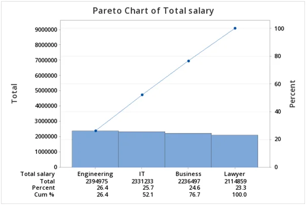
Fig 6:Pareto chart of total salary
Question 2A:TV Life Expectancy Analysis
2.1 Probability Calculations
- P(X 3,350): 0.2266
- P(X 3,750): 0.1056
- P(3,350 X 3,750): 0.6677
2.2 Finding X for P(X x) = 0.95
If P(X x) is 0.95, then x is calculated as 3,828.97. Therefore, the TV life expectancy is approximately 3,828.97 units.
Question 2B: Service Time Analysis
2.1 Probability Calculations
- P(Service 6 min): 0.8223
- P(Service 4 min): 0.7227
- P(4 min ; X 6 min): 0.5450
2.2 Finding X for P(X x) = 0.95
If P(X x) is 0.95, then x is calculated as 6.95 minutes, which implies serving approximately 9 customers per hour.
Question 2C: Orange Delivery Analysis
To meet the contract terms of delivering at least 20 tons of oranges every week:
P(X 20): 0.7827
If P(X x) is 0.95, then x is calculated as 27.8 tons per week. Therefore, there is a 95% confidence that 27.8 tons of oranges will be delivered each week.
Question 3: Process Capability Analysis
- The data is normally distributed (p-value = 0.233).
- The process is not centered (Ppk ≠ Pp) but is in statistical control (Ppk ≈ Cpk).
- Process capability does not meet the benchmark (Cpk 1.33).
- Process improvement is needed to meet customer expectations.
Questions 4A 4B
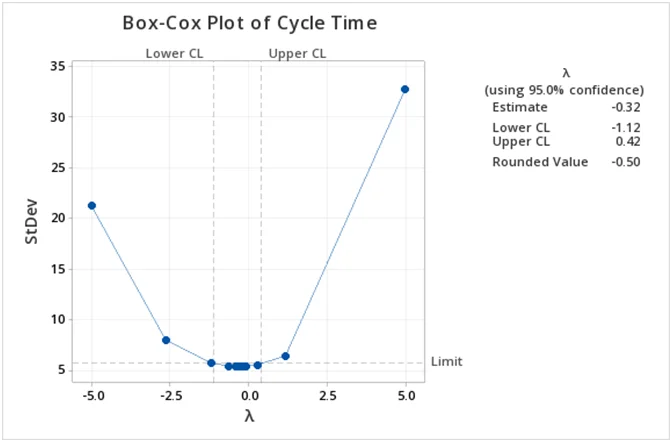
Fig 7: Box-cox plot of cycle time
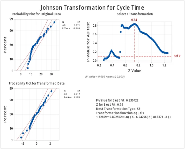
Fig 8:Johnson Transformation for Cycle Time
Question 5:Production Process Stability Analysis
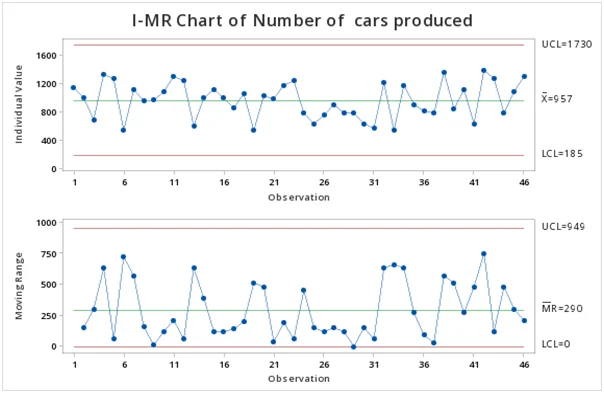
Fig 9:Control Chart of Number of Cars Produced
The control chart demonstrates that the daily production process of cars is stable, with only common-cause variation and no out-of-control points.
Question 6:Time Series Analysis
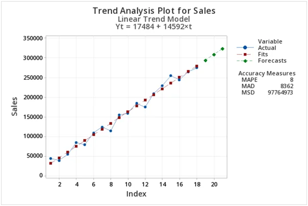
Fig 10:Trend Analysis Plot for Sales
The time series plot reveals an upward trend with no evident seasonal variation. The model accuracy, with a Mean Absolute Percentage Error (MAPE) of 8%, suggests a well-fitted model.
Conclusion
In conclusion, this analysis of employee data and various probability scenarios provides valuable insights. We've examined job level distribution, education, sector distribution, salary statistics, and conducted probability calculations for TV life, service time, and orange delivery. Additionally, we've assessed process capability, production process stability, and a time series forecast. These findings emphasize the importance of data-driven decision-making and process improvement in meeting and exceeding organizational objectives.
Related Samples
Step into our sample section, a treasure trove of statistical illustrations awaiting exploration. From inferential statistics to multivariate analysis, delve into diverse examples showcasing real-world applications. Gain valuable insights and sharpen your analytical prowess with meticulously crafted case studies. Let our curated samples be your gateway to mastering the complexities of statistical inference.
Data Analysis
Data Analysis
Data Analysis
Data Analysis
Statistics
Data Analysis
tableau
Data Analysis
Data Analysis
Data Analysis
Data Analysis
Data Analysis
Data Analysis
R Programming
Data Analysis
Probability
Data Analysis
Data Analysis
Data Analysis
Data Analysis