Data Analysis: Understanding Housing Market Trends and Student Height-Weight Relationships

- Problem Description:
- A. Data Visualization and Tabulation:
- 1. Line Graph of Average Mortgage Prices (CMHPIX):
- 2. Table of Average Mortgage Prices (CMHPIX):
- B. Analysis and Interpretation:
- Housing Market Behavior (1995-2007):
- Predicting the U.S. Housing Bubble:
- Part 2: Analyzing Student Height and Weight Relationship
- A. Data Visualization and Tabulation:
- B. Analysis and Interpretation:
In this comprehensive sample analysis, we delve into two distinct aspects of data interpretation. Firstly, we explore housing market trends by visualizing average mortgage prices in low and high volatility states from 1997 to 2007. This offers valuable insights into the stability and fluctuations within the housing market during this crucial period. Secondly, we scrutinize the relationship between student height and weight, examining whether gender plays a role in these associations. This sample analysis provides a glimpse into the power of data analysis tools and their application in understanding complex real-world scenarios.
Problem Description:
In this data analysis assignment, we were tasked with utilizing two data analysis tools - GraphBuilder and Tabulate - to gain insights into the housing market using mortgage data from 1997 to 2007. Our primary focus was to compare home prices in low and high volatility states.
A. Data Visualization and Tabulation:
1. Line Graph of Average Mortgage Prices (CMHPIX):
To visualize the changes in average mortgage prices, we constructed a line graph for low and high-volatility states, spanning the period from 1997 to 2007.
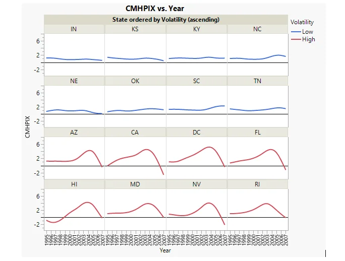
Fig 1. Line Graph of average mortgage prices (CMHPIX) in low and high volatility states in the period from the year 1997 to 2007.
2. Table of Average Mortgage Prices (CMHPIX):
Next, we tabulated the average mortgage prices for different states during the same time frame.
| CMHPIX | |
|---|---|
| State | Mean |
| AZ | 1.89 |
| CA | 1.95 |
| DC | 2.63 |
| FL | 2.08 |
| HI | 1.14 |
| IN | 0.89 |
| KS | 1.01 |
| KY | 1.20 |
| MD | 1.90 |
| NC | 1.27 |
| NE | 0.76 |
| NV | 1.36 |
| OK | 1.08 |
| RI | 1.87 |
| SC | 1.46 |
| TN | 1.27 |
Table 1: CMHPIX in low and high volatility states in the period from starting from 1997 up until 2007.
B. Analysis and Interpretation:
We analyzed the graph and table to answer two key questions:
Housing Market Behavior (1995-2007):
- The average home prices in low volatility states remained relatively stable from 1995 to 2007.
- In high volatility states, home prices increased between 1995 and 2003 and then sharply declined from 2003 to 2007.
Predicting the U.S. Housing Bubble:
- Yes, it is possible to predict the housing bubble in the United States before it bursts.
- Macroeconomic parameters such as housing demand, monetary policy, and interest rates can be valuable indicators for predicting housing market fluctuations.
Part 2: Analyzing Student Height and Weight Relationship
Problem Description: For Part 2 of the assignment, we were instructed to employ the FitYbyX tool to analyze the relationship between student height and weight in the Little Class dataset, focusing on any gender differences.
A. Data Visualization and Tabulation:
Scatter Plot of Student Height and Weight:
We created a scatter plot to visualize the relationship between student height and weight.
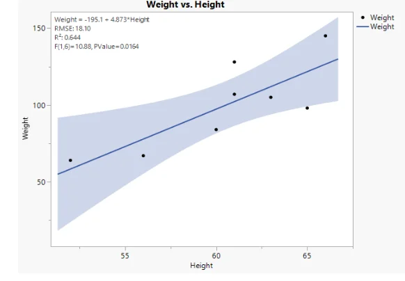
Scatter Plot of Student Height and Weight
Tables of Average Height and Weight by Gender:
- Average height and weight measurements were tabulated for male and female students.
| Sex | Average Height |
|---|---|
| F | 56.33 |
| M | 63.00 |
| Sex | Average Weight |
|---|---|
| F | 79.33 |
| M | 112.00 |
B. Analysis and Interpretation:
We addressed several questions related to the student height and weight data:
Relationship between Weight and Height:
- Yes, there is a positive linear relationship between the weight and height of students.
How Are Weight and Height Related?
- As students' height increases, so does their weight.
Gender Differences:
- There are significant gender differences in the relationship between weight and height. Males tend to be taller and heavier compared to females.
By restructuring and presenting the assignment solution in this organized manner, you provide a clear and concise overview of your analysis and findings, making it more accessible to your website visitors.
You Might Also Like
Explore our diverse sample collection for insightful assignments covering fundamental concepts to advanced methodologies. Dive into a wealth of topics and solutions tailored to your needs. Unlock valuable knowledge and inspiration through our curated samples.
Data Analysis
Data Analysis
Data Analysis
Data Analysis
Statistics
Data Analysis
tableau
Data Analysis
Data Analysis
Data Analysis
Data Analysis
Data Analysis
Data Analysis
R Programming
Data Analysis
Data Analysis
Data Analysis
Data Analysis
Data Analysis
Data Analysis